
Zoho Show
Zoho Corporation
2023
Zoho Corporation

B2B
SaaS
Shipped
In early 2023, we launched a comprehensive redesign of Zoho Show for Apple platforms, enhancing the experience for over 1 million users. The project overhauled the design system, introduced new visual assets and features, and established a fixed developer handoff workflow, improving usability and visual consistency across the app.
Team
Sriram Hemanth Kumar
UI Designer
Rangarajan
UI Manager
Damodharan Sundarajan
Design Architect
Duration
2 years
Jan 2021 - Jan 2023
Tools
Figma
Photoshop
Zoho Nila
Some details are withheld under NDA to protect company information. Shared content is disclosed with the company’s permission.
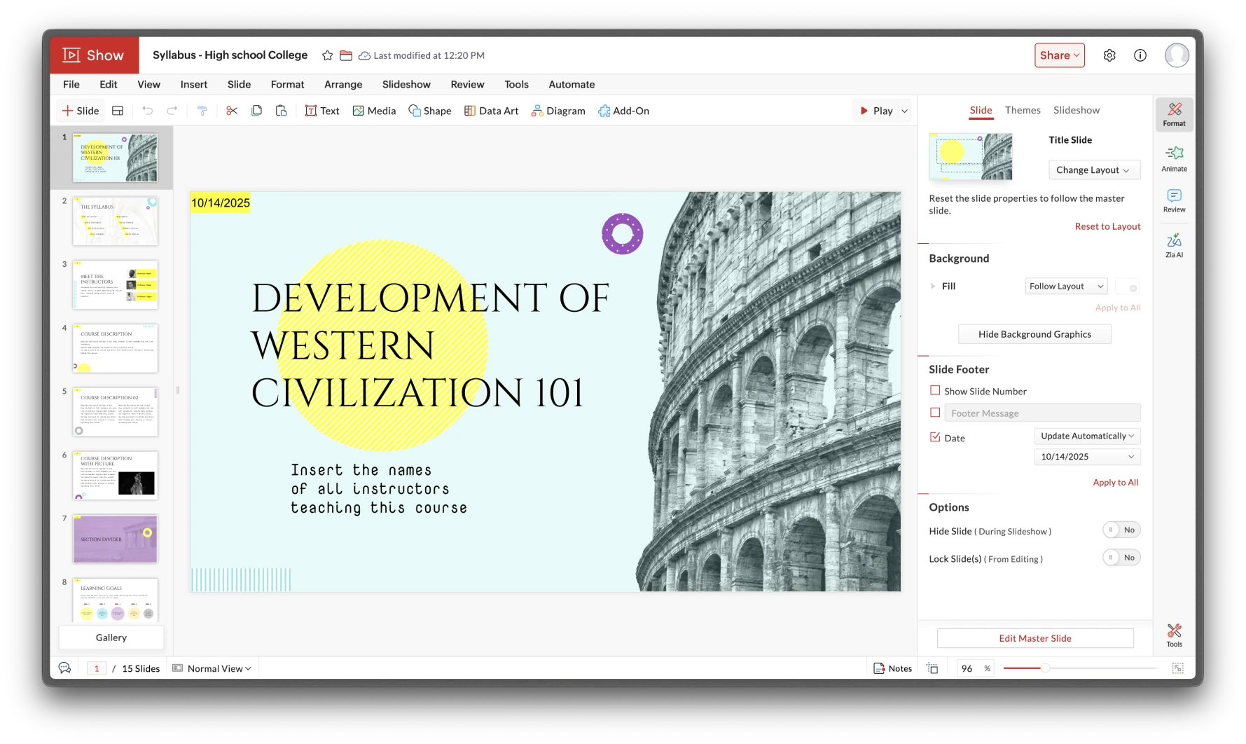
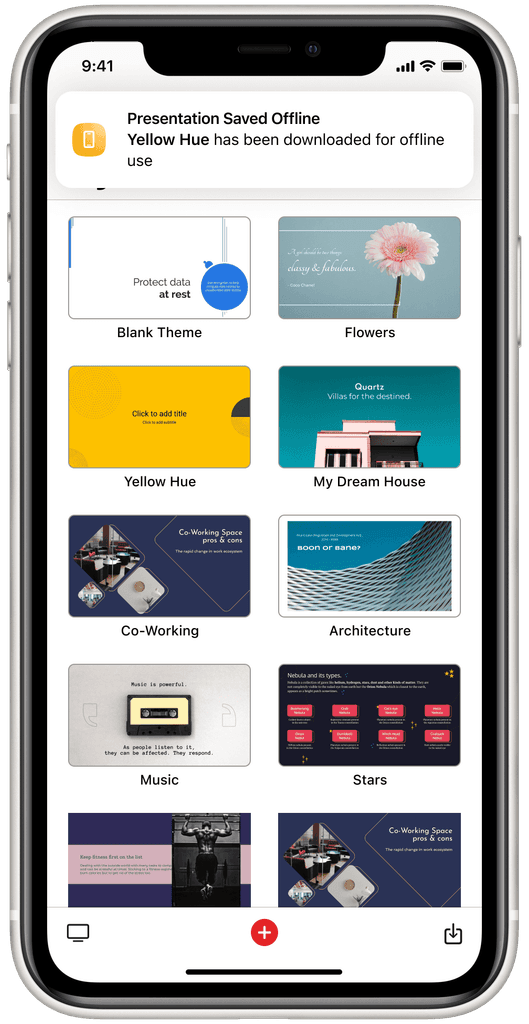
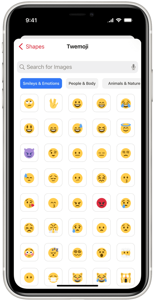
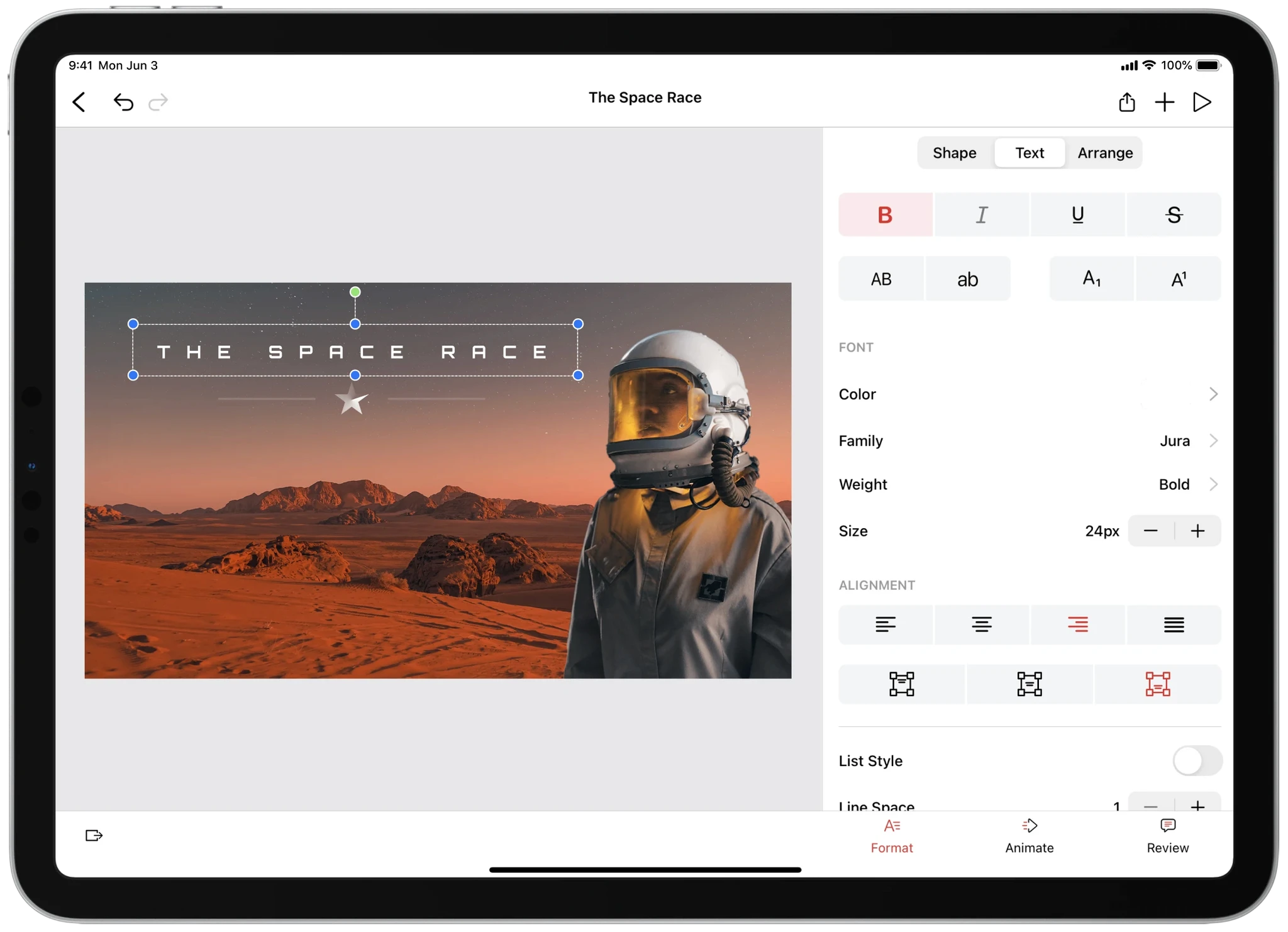
Zoho Show is a cloud-based presentation tool for creating, editing, and collaborating on slides. It offers real-time collaboration, templates, animations, and multimedia support, integrating seamlessly with Zoho apps and third-party tools.
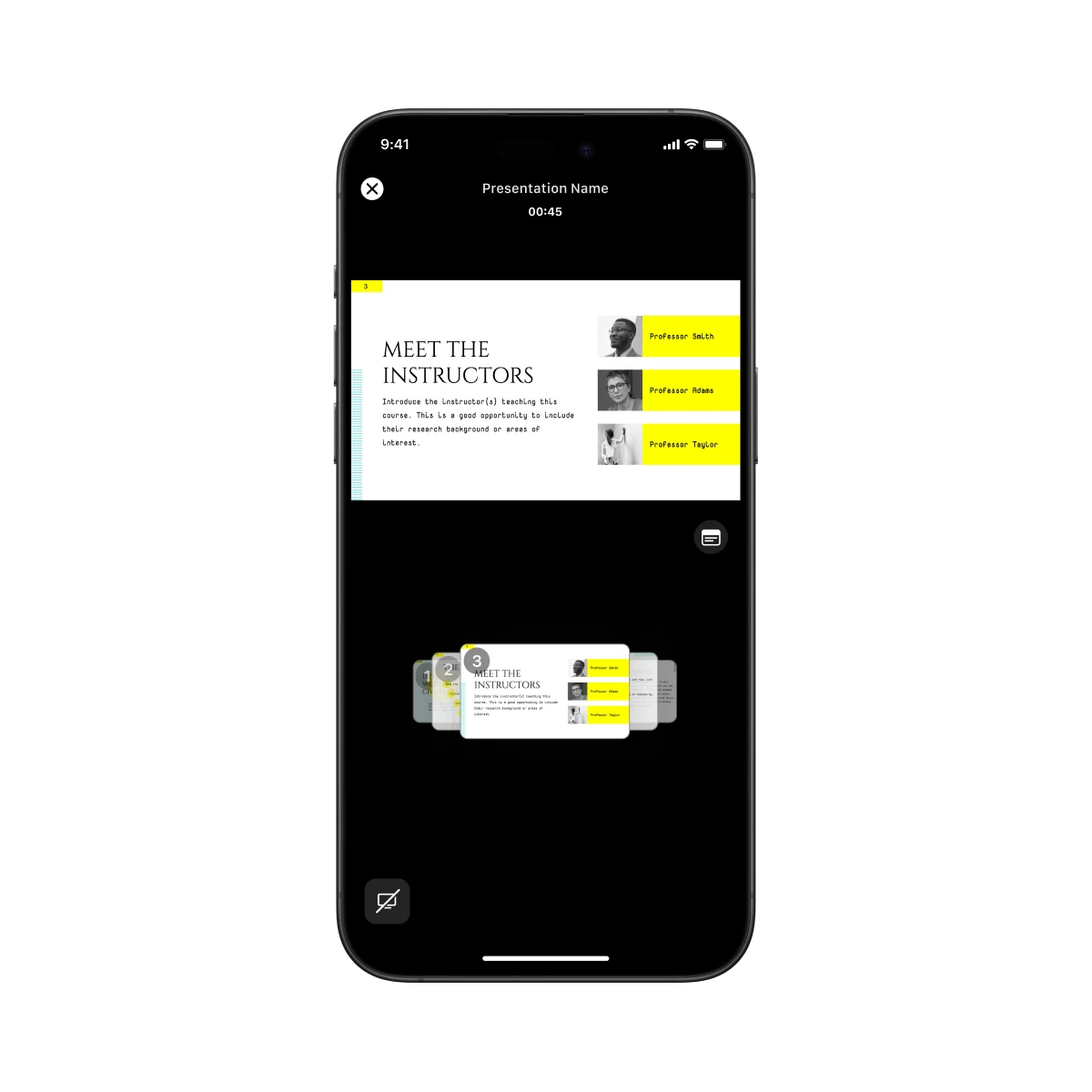
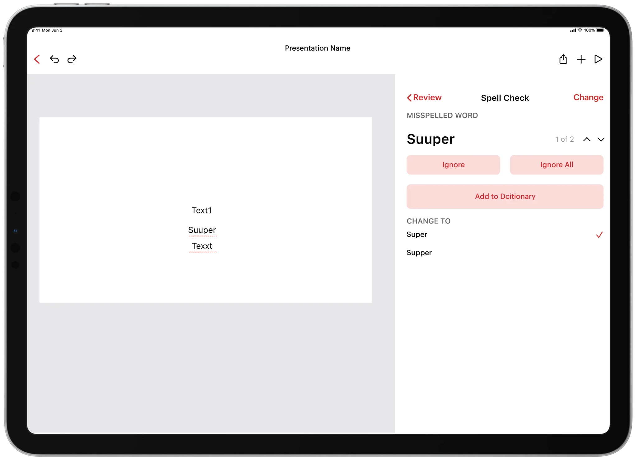
My first assignment was to design an annotation feature for the presentation view. The goal was straightforward — allow users to mark or highlight slides during a presentation. But as I reviewed the interface, I began noticing subtle inconsistencies between the editor and presentation views where spacing felt off, icons behaved differently, and native system behaviors weren’t applied consistently. What started as a small feature revealed something much larger beneath the surface.
It became clear that these inconsistencies weren’t isolated mistakes but symptoms of a deeper workflow issue. Designers were creating variations of the same components repeatedly, while developers coded one-off UI elements without documentation or guidelines. After discussing with both teams, I realized the real bottleneck was the lack of a shared design language. There was no single source of truth connecting design and development, which led to visual drift and redundant work.
Digging further into the process, I mapped how elements were created, implemented, and updated. Designers spent time perfecting minor details that never translated correctly into development, while developers wrote ad-hoc solutions for missing components. Every handoff introduced more inconsistency, which compounded over time. The product needed a scalable design foundation that could unify teams, reduce rework, and align with Apple’s Human Interface Guidelines.
Zoho Show initially lacked a unified design system and relied on custom-built components, leading to compatibility issues across different OS versions and inconsistent user experiences.
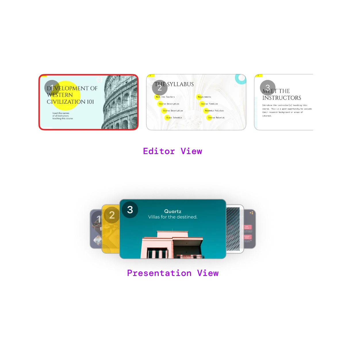
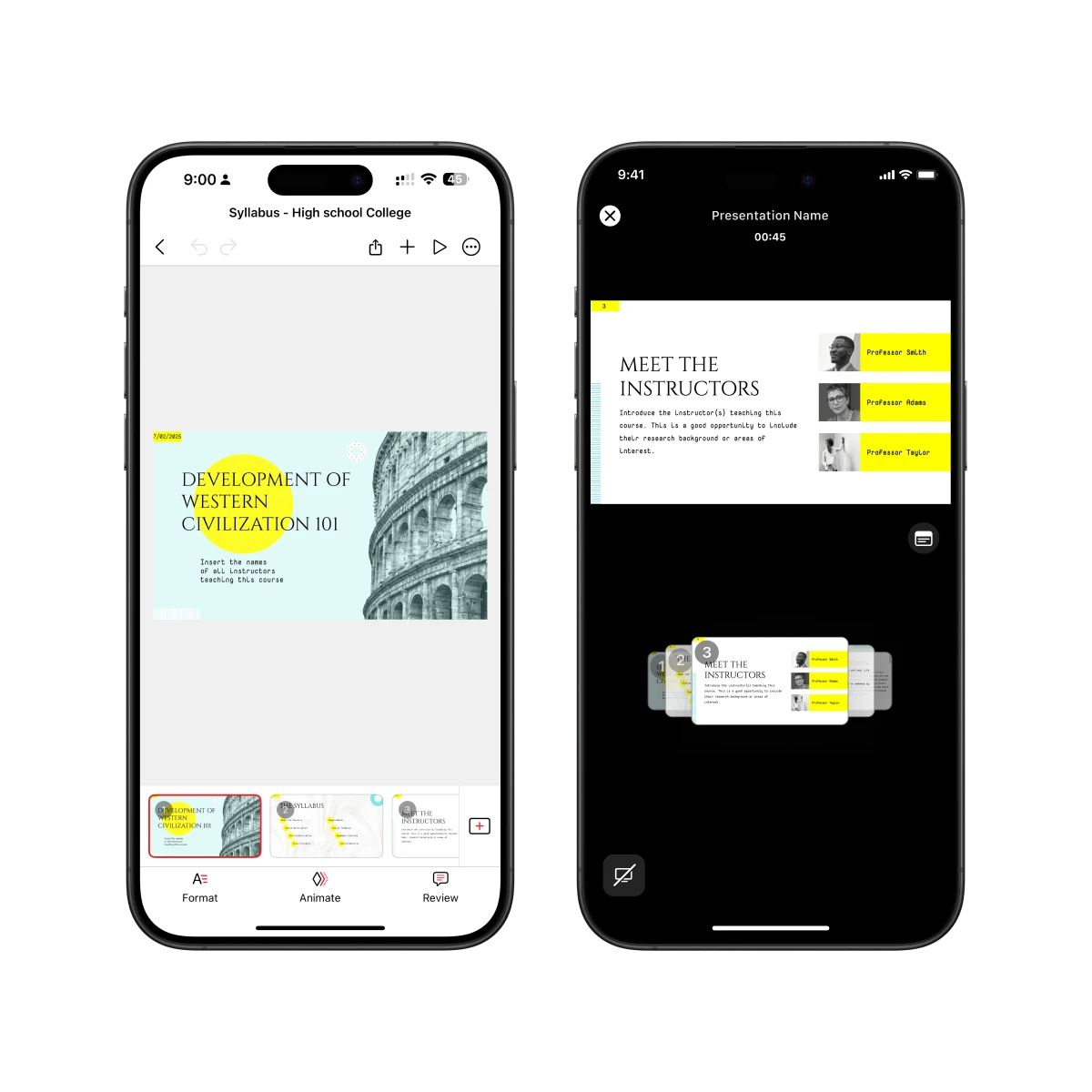
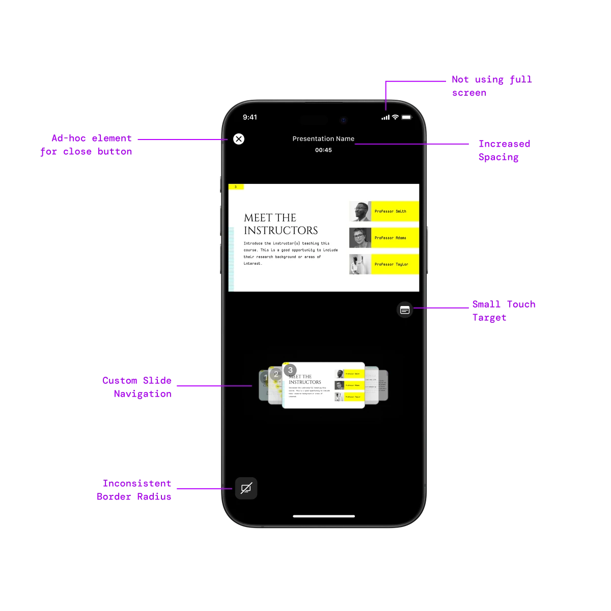
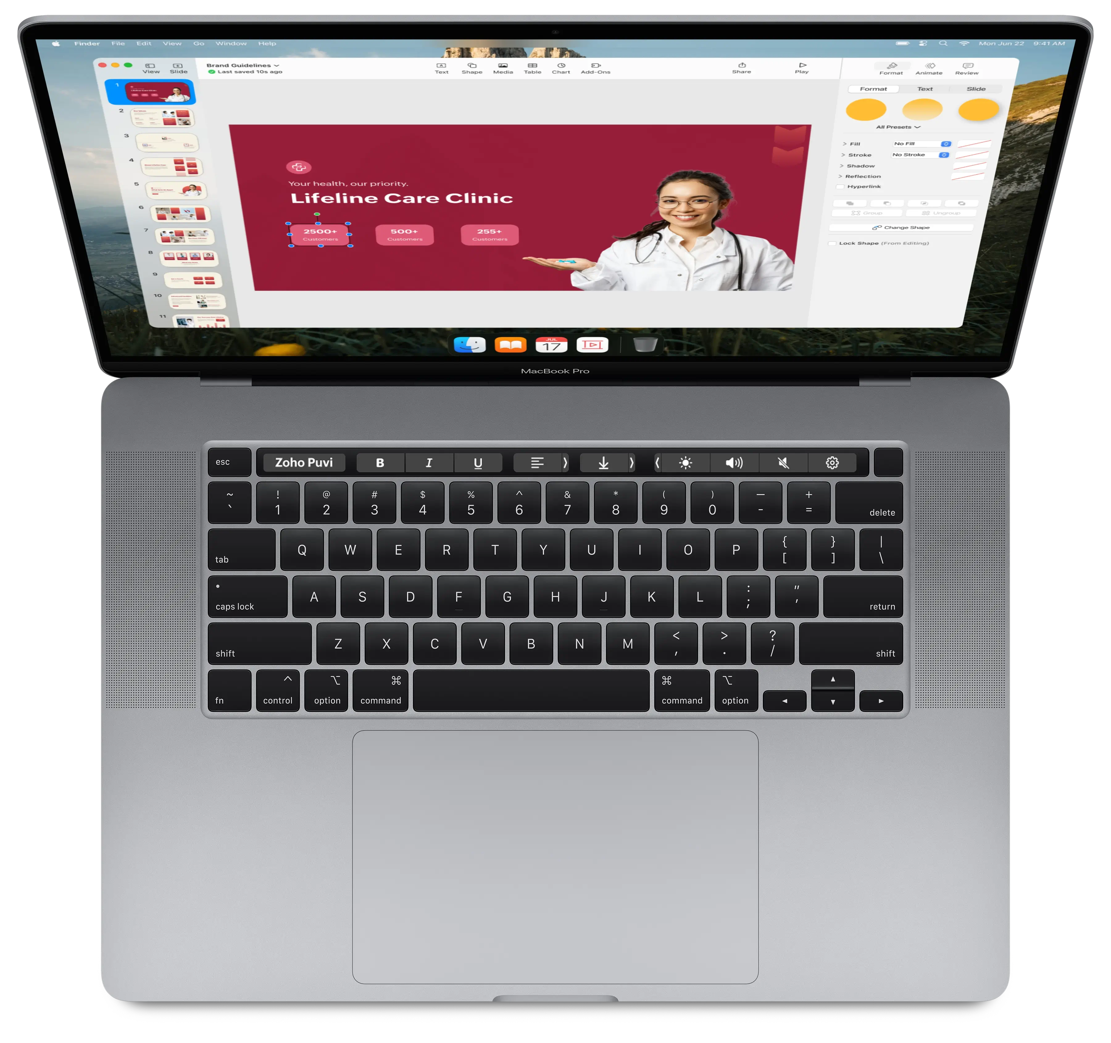
When comparing the Editor View and Presentation View, it was clear the same components looked and behaved differently. Each screen had been designed in isolation, with no shared structure or tokens.
This caused redundant work and visual drift , designers rebuilt components manually, and developers recreated ad-hoc versions for every feature. The lack of modularity made updates slow and inconsistent.
This inconsistency highlighted the need for a unified component library that could scale seamlessly across views and platforms.
To understand the true cost of this issue, I conducted a qualitative research phase with designers and developers to analyze their workflow. I analyzed their workflow and communication process to identify gaps and challenges in execution.
Without documentation or a proper design system, developers had to build “ad-hoc” UI elements for even basic components. Each screen required fresh code, creating brittle implementations that slowed releases and built up technical debt.
Designers were stuck refining the same elements repeatedly with no shared tokens or structure. Minor variations crept in — different border radii, spacing, and color values — breaking visual consistency and platform alignment.
This eventually revealed another core problem miscommunication between designers and developers, caused by the absence of shared guidelines, documentation, and a single source of truth.
The research made it clear that there was no single source of truth guiding design or development decisions. Every designer interpreted components differently, and developers built their own versions to fill in missing details. Specs, behaviors, and usage rules were scattered or undocumented, leading to guesswork and inconsistent results.
Without clear guidelines, even small updates caused confusion and rework. The lack of documentation slowed down the process and it broke the alignment across teams and making consistency impossible to maintain.
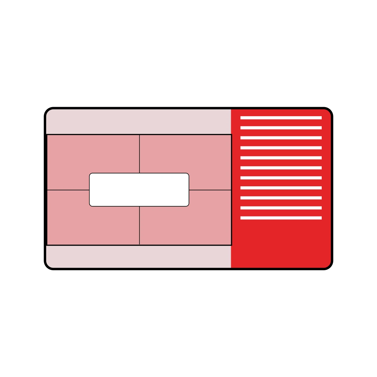
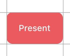
To address these issues, I analyzed Apple’s Design System and proposed building a structured system for Zoho Show. This involved replacing ad-hoc elements like labels placed within rectangles with native system components such as buttons, improving platform compatibility and ensuring a consistent user experience across devices.
Research & Transition
I studied Apple’s Human Interface Guidelines and internal documentation to determine how to transition existing designs into system components without compromising brand identity.
Developer Integration
We built a design system with tokens and reusable classes, making it easier for developers to implement designs accurately.
Standardized Workflow
I defined a clear process that all designers could follow, ensuring consistency across the team.
Design
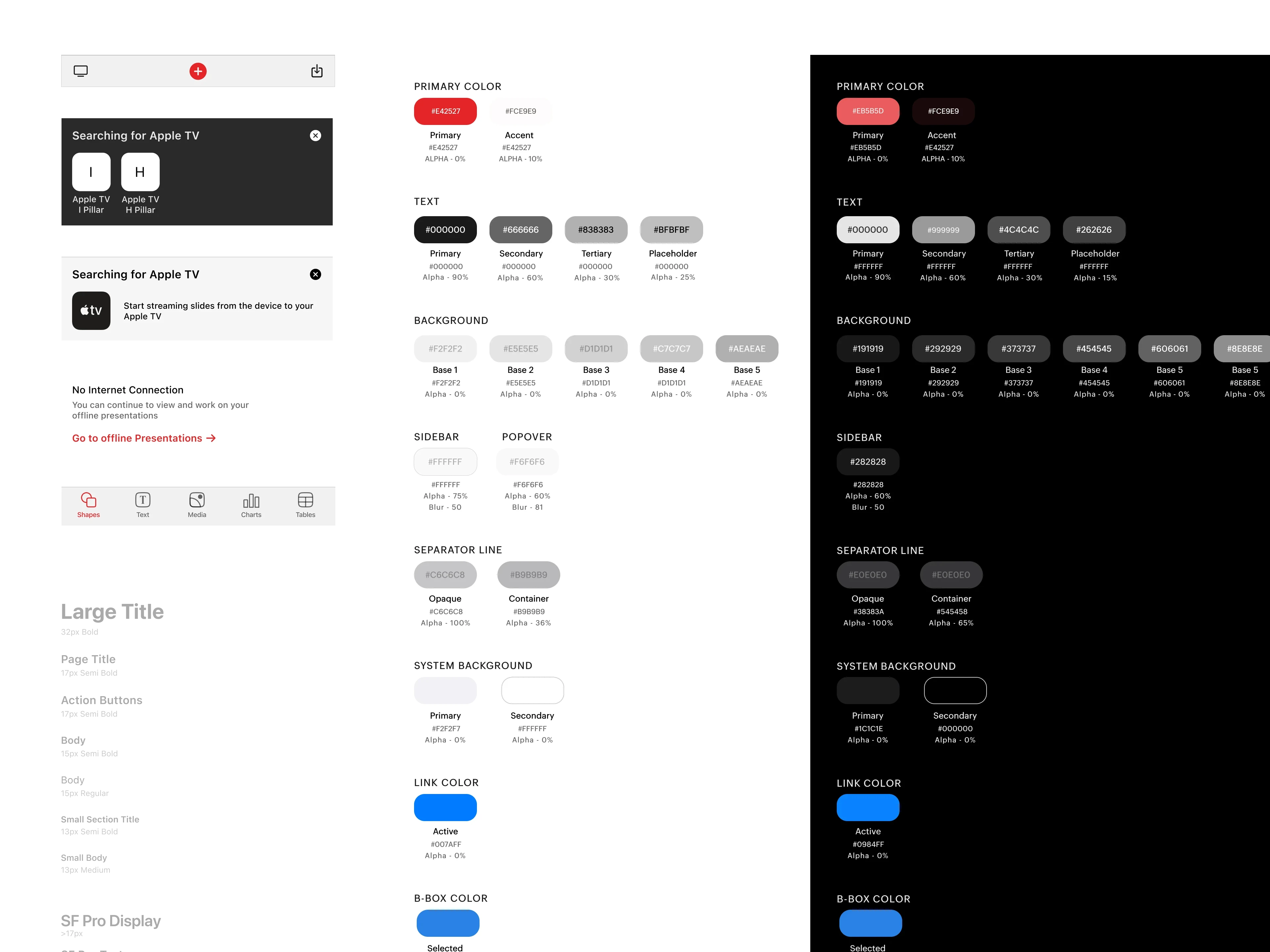
Created a style guide and reusable components based on Apple’s HIG, ensuring consistency across light and dark modes.
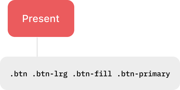
Tokenize
Mapped components to semantic tokens for scalability and structure.
Handoff
Integrated tokens and components directly in Figma to streamline developer handoff and reduce ambiguity during implementation.
Development
Developers utilize the integrated design system and its tokens, which were shipped as a library to build new features and simultaneously replace all old, ad-hoc UI elements with standardized components.
We tackled the initial "mismatch" and "inconsistencies" by establishing a clear Style Guide, which finally set the foundational rules for visual consistency
This guide was built on the foundation of the Apple Human Interface Guidelines , ensuring the app felt native to iOS while carefully preserving the unique visual DNA of the Zoho brand.
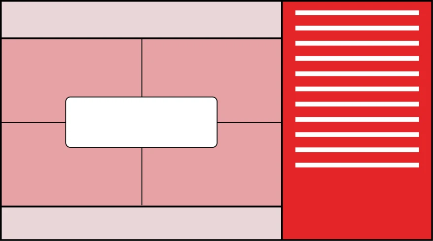
Building upon the Style Guide, we adapted the Atomic Design approach to ensure that consistency extended to the fundamental structure of all app elements. Components were broken down into their smallest parts, such as Atoms (Typography, Icons, Colors), then assembled into Molecules (Buttons), and finally into complex Organisms (Alignment controls) , providing a scalable and highly consistent component library.
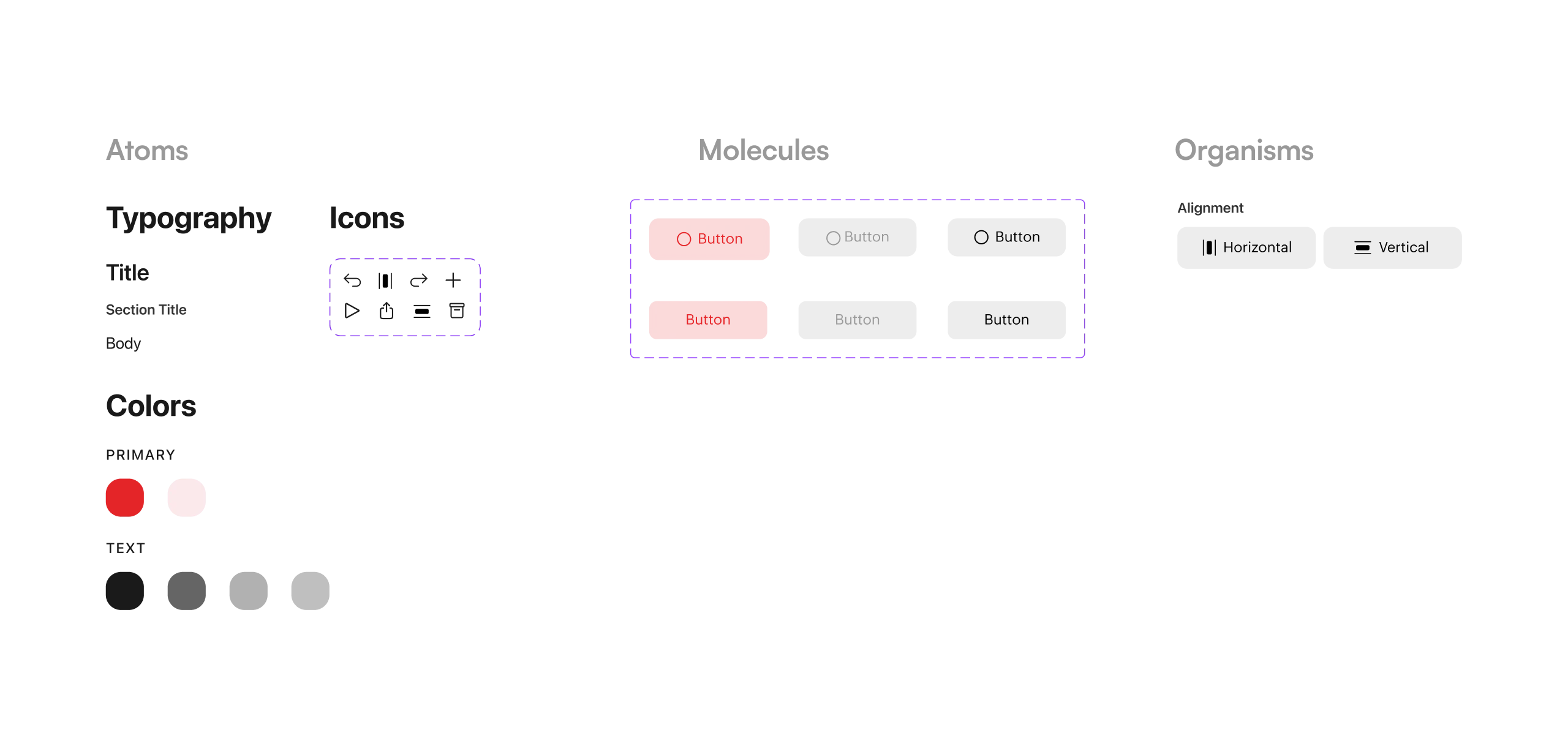
By creating a foundational Style Guide and a library of reusable components, the team established a single source of truth. This unified approach resolved the core issues of platform inconsistency and redundant design effort, ensuring the app felt cohesive and polished across both light and dark modes .
Established a Comprehensive Semantic Token System
We mapped components to a system of semantic tokens for both scalability and structure, moving beyond hardcoded values.
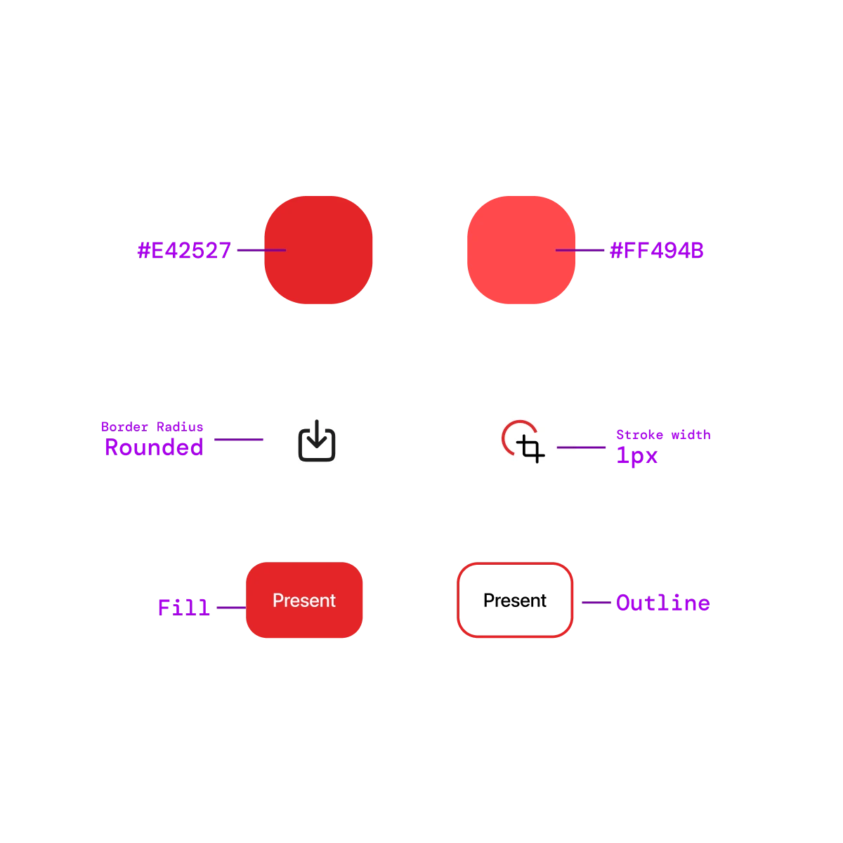
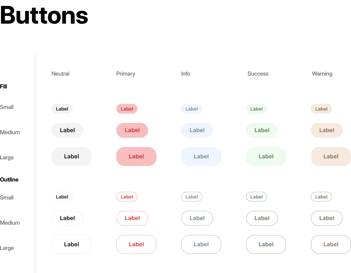
Defined Intent-Based Token Categories
Tokens were defined to categorize visual elements by their functional intent (e.g., Neutral, Primary, Success for feedback) and variations (e.g., Fill, Outline), which allows for consistent, rapid theming across all component types.
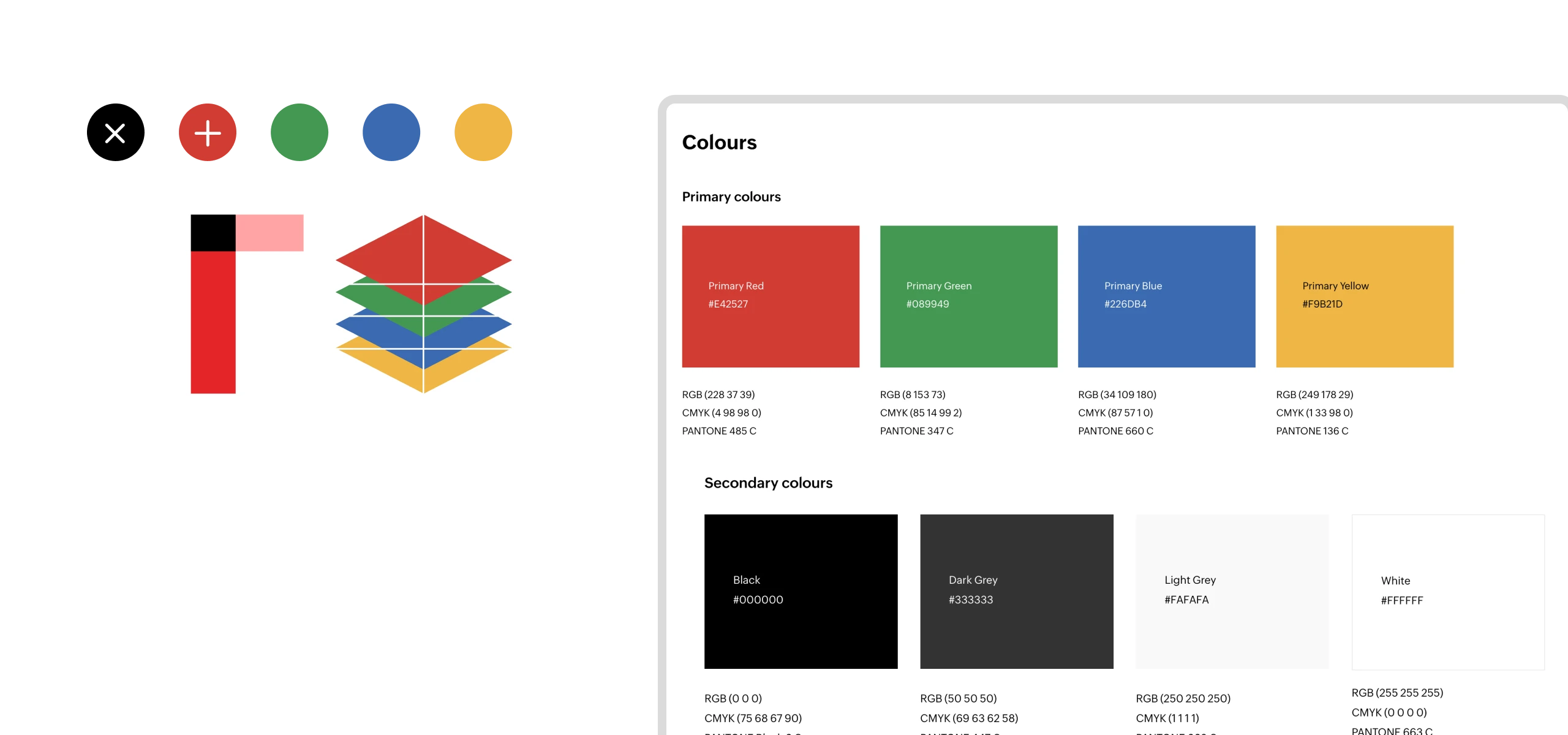
Colors
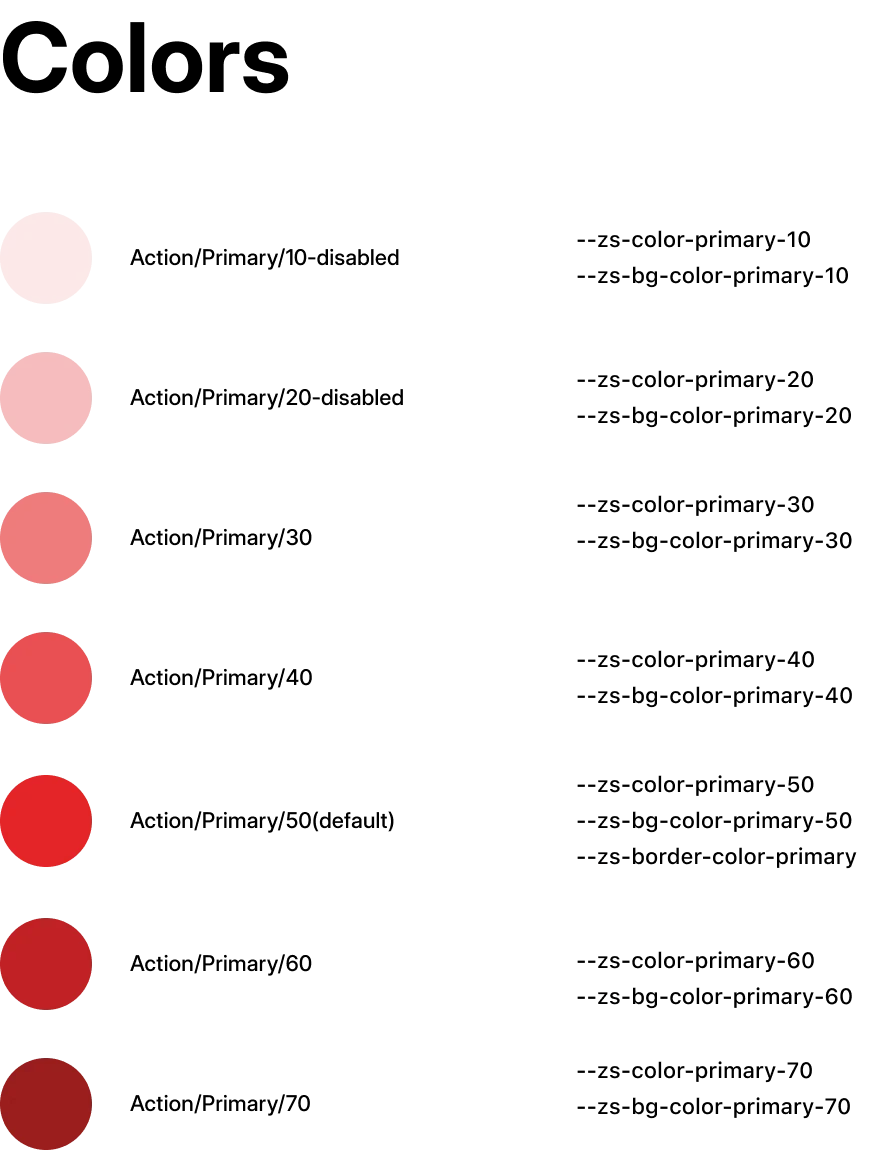
The shift to a semantic token system was a crucial turning point, moving the app's design from brittle to scalable. By defining a system based on intent rather than hardcoded values, the team set the stage for rapid, system-wide updates, making future theming and platform scaling a simple, manageable process.
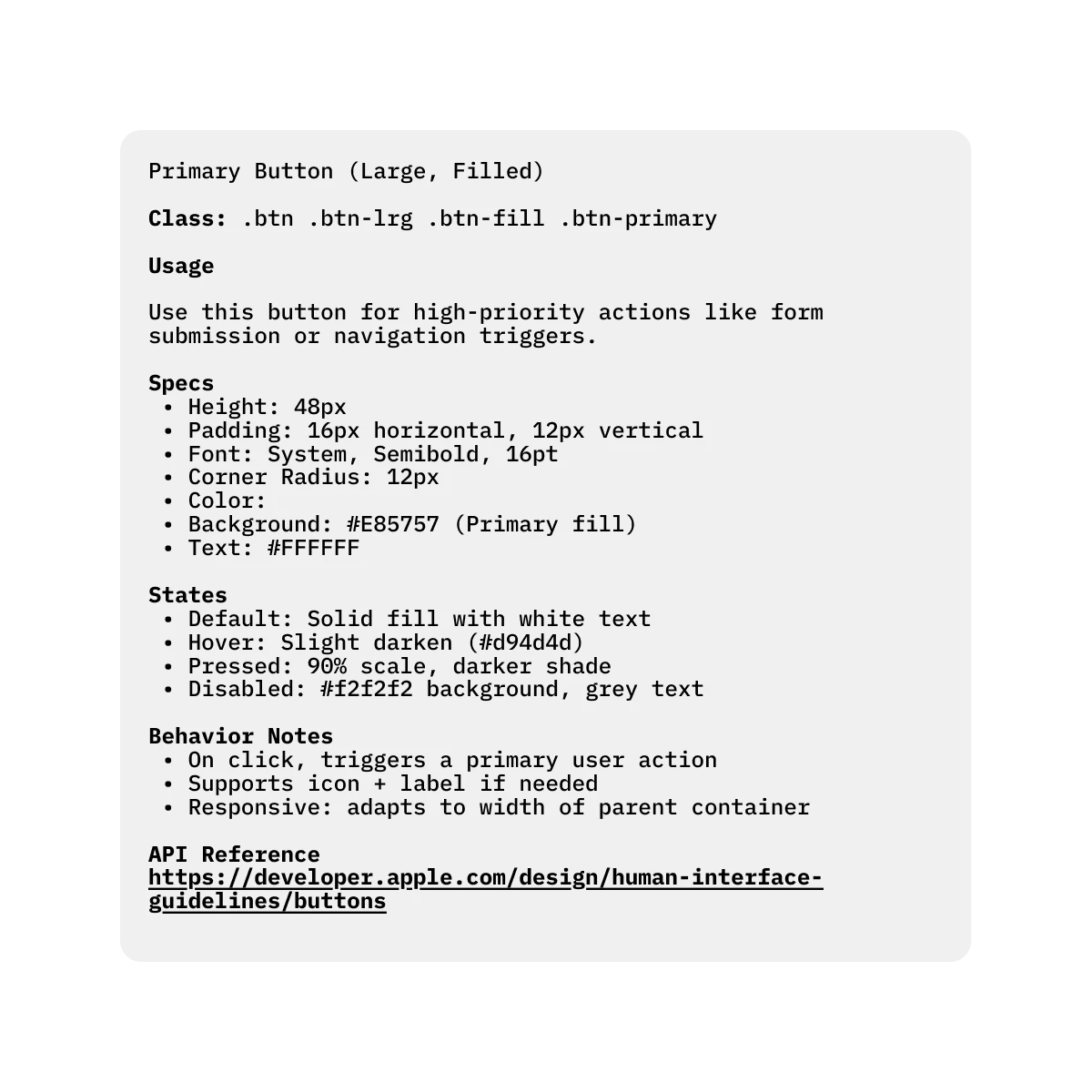
Clear documentation became a key part of the workflow. Each component included specs, behavior notes, and API references so developers understood not just how a component looked, but how it was intended to behave in different states and contexts.
This created a shared reference point for both design and engineering, reducing guesswork and eliminating back-and-forth clarification. By standardizing how components were described and handed off, we ensured consistency across features and made development more predictable and scalable.
Dev Sheet
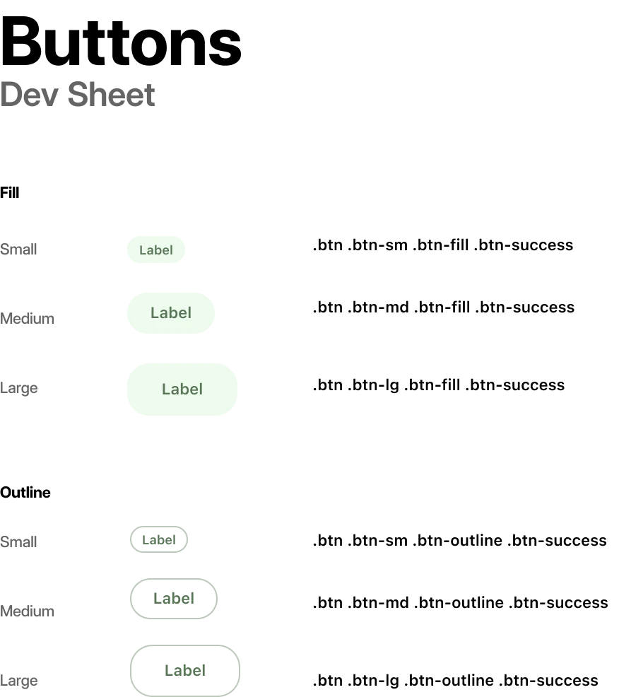
Specifications
With clear documentation connecting the new tokens and components directly into the workflow, the ambiguity that slowed down the team was resolved . This streamlined handoff process bridged the gap between design and development, allowing developers to build with confidence and precision, free from the guesswork of the old system .
With a consistent component library and clear usage guidelines in place, developers could plug in standardized UI patterns instead of having to interpret or recreate them. This removed guesswork during implementation and reduced back-and-forth with design. As a result, building new features became more about functionality and logic, rather than UI reconstruction.
Ad-hoc elements were replaced with system-native components, leveraging platform APIs for better optimization and consistency.
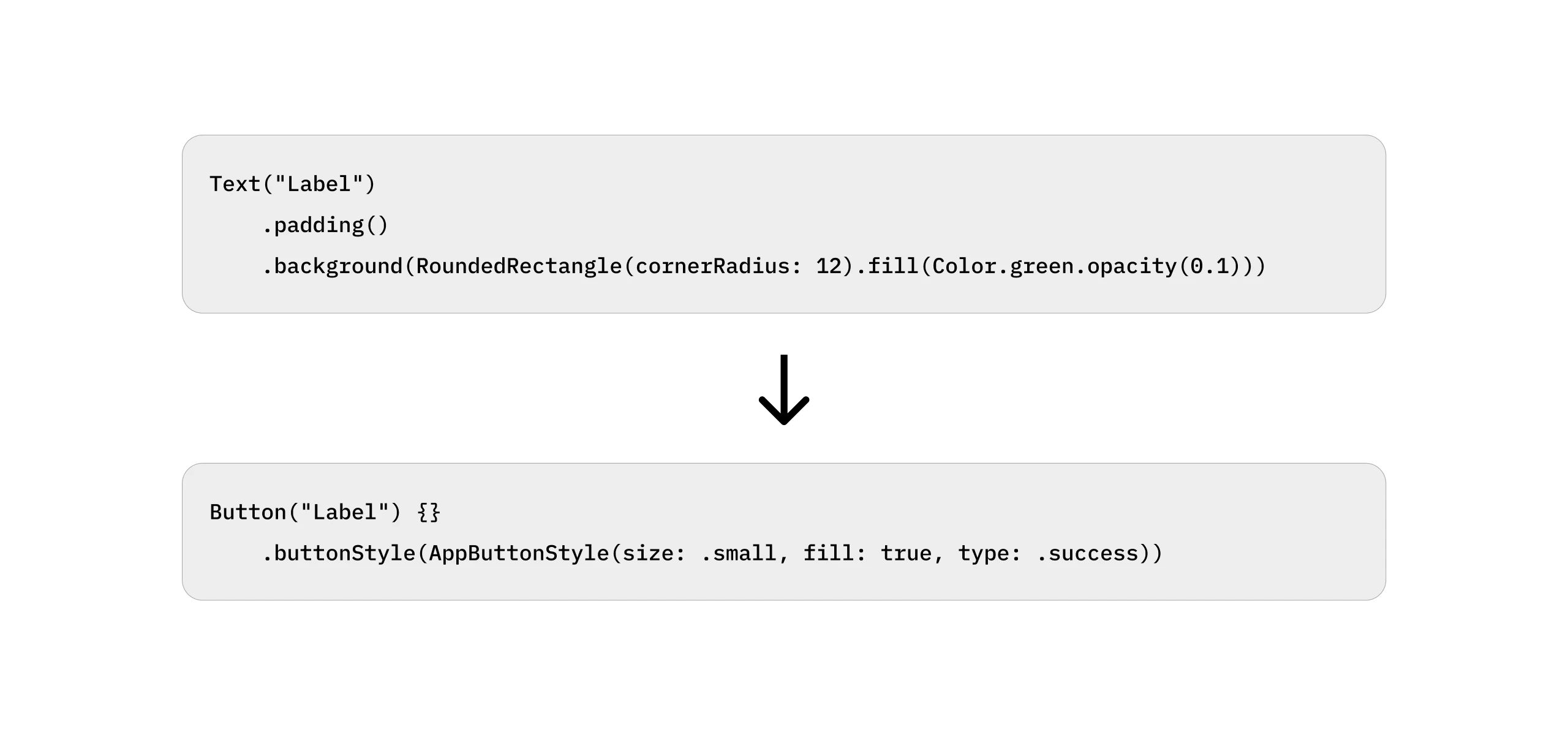
The final phase of replacing legacy code with new, system-native components unlocked dramatic, measurable performance gains. This systematic cleanup directly addressed years of technical debt and performance lag. The new, lighter codebase, in some cases, reducing four lines of code to just one, led directly to a 46% reduction in render time and a 39% reduction in development time.
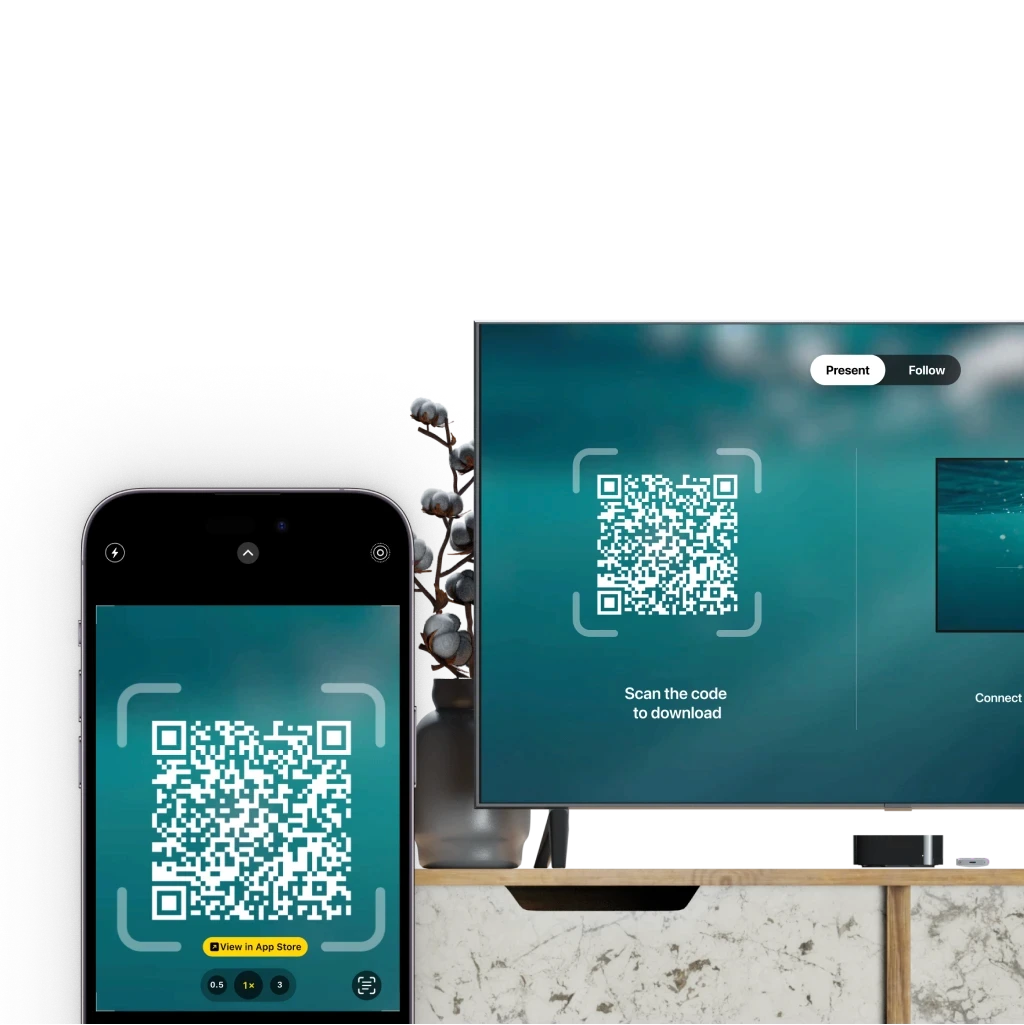
Following the redesign, the improved design system and proposed workflow enabled the team to efficiently roll out new features across macOS, iOS, and iPadOS. With a unified component library and standardized interaction patterns, features could be seamlessly adapted across platforms.
Some of the key enhancements introduced after the redesign include:
Mobile-First Design
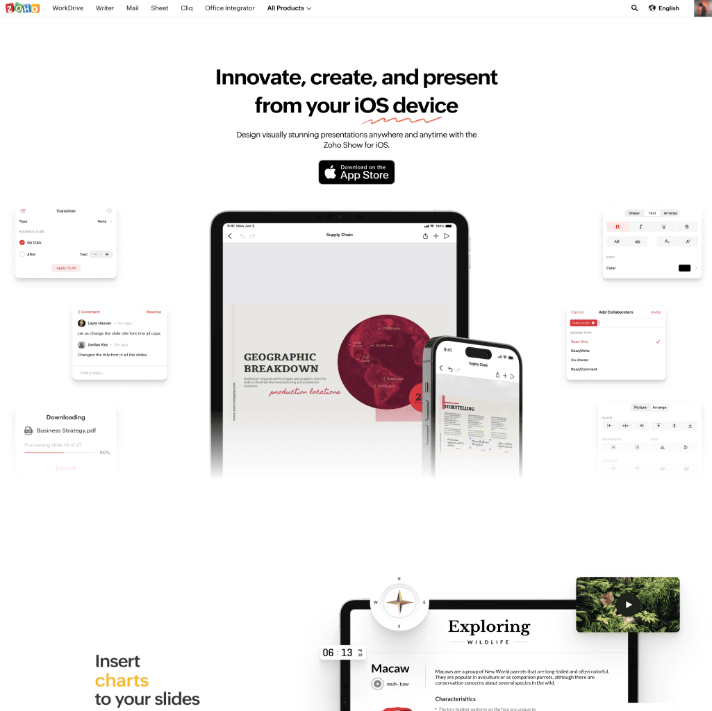
After the web, usage shifted significantly towards mobile phones, so we decided to focus on mobile.
Gesture Integration
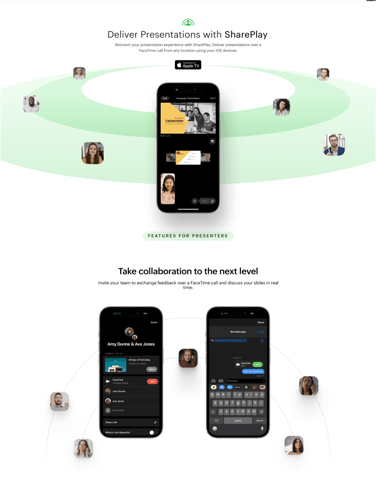
Leveraged iOS's rich gesture vocabulary, allowing users to navigate, edit, and present with intuitive swipes, pinches, and taps.
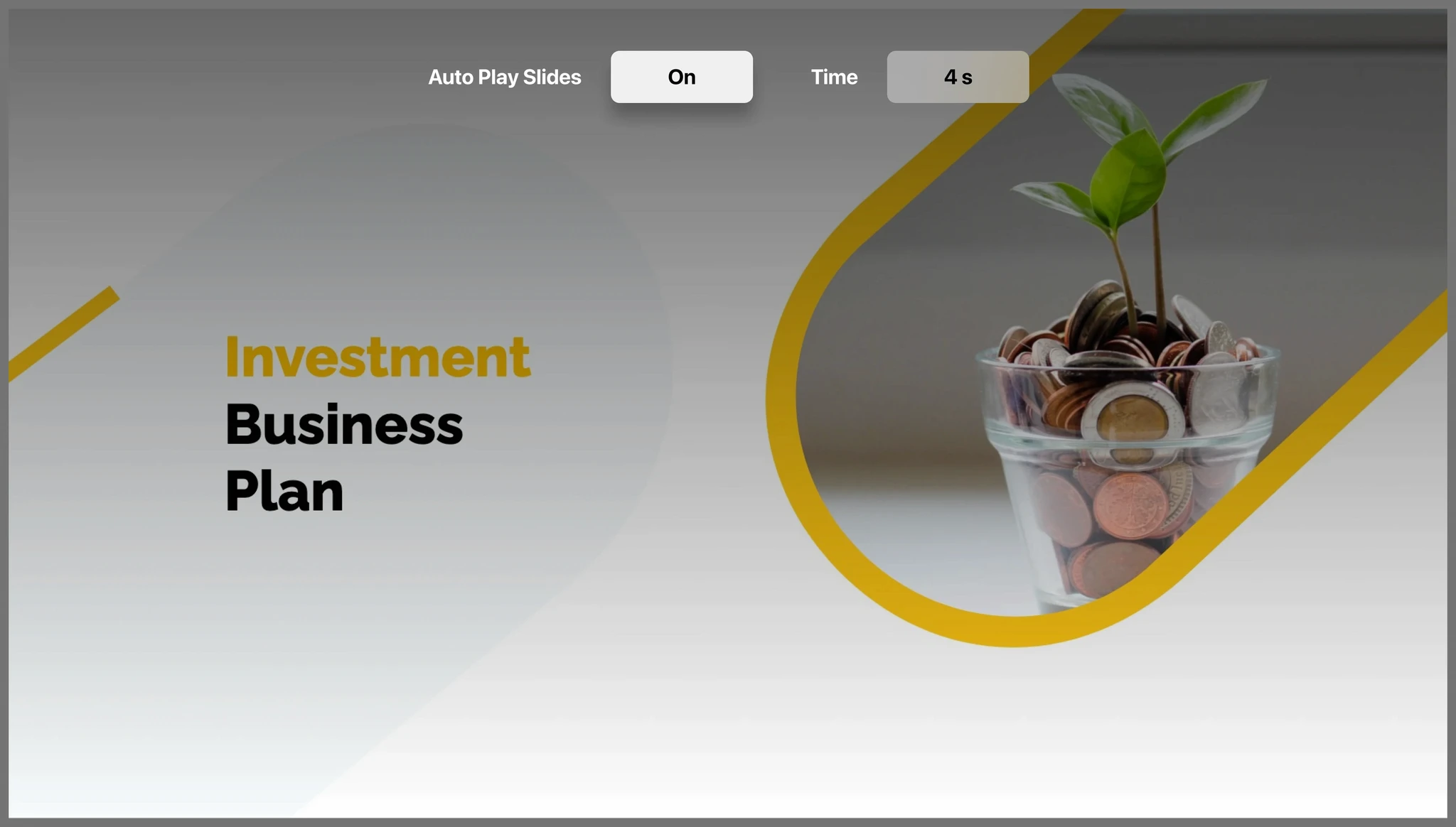
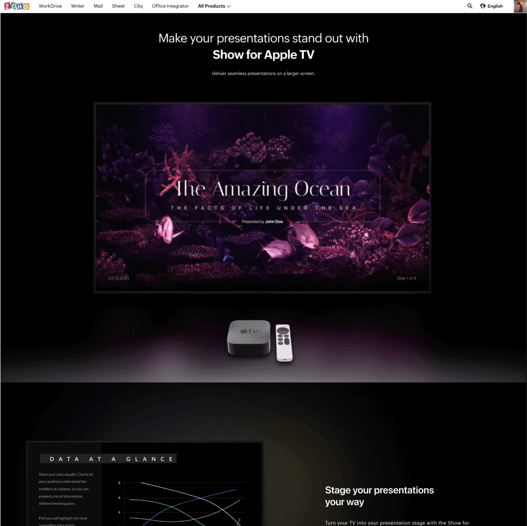
Onboarding Experience for Apple TV
Streamlined the onboarding process to enhance user engagement on Apple TV.
Simplified Navigation
Recognizing the remote-driven interaction of Apple TV, I designed a streamlined interface that's easy to navigate from the couch.
Slide Controls Design
Developed intuitive slide controls to improve user interaction within the app.
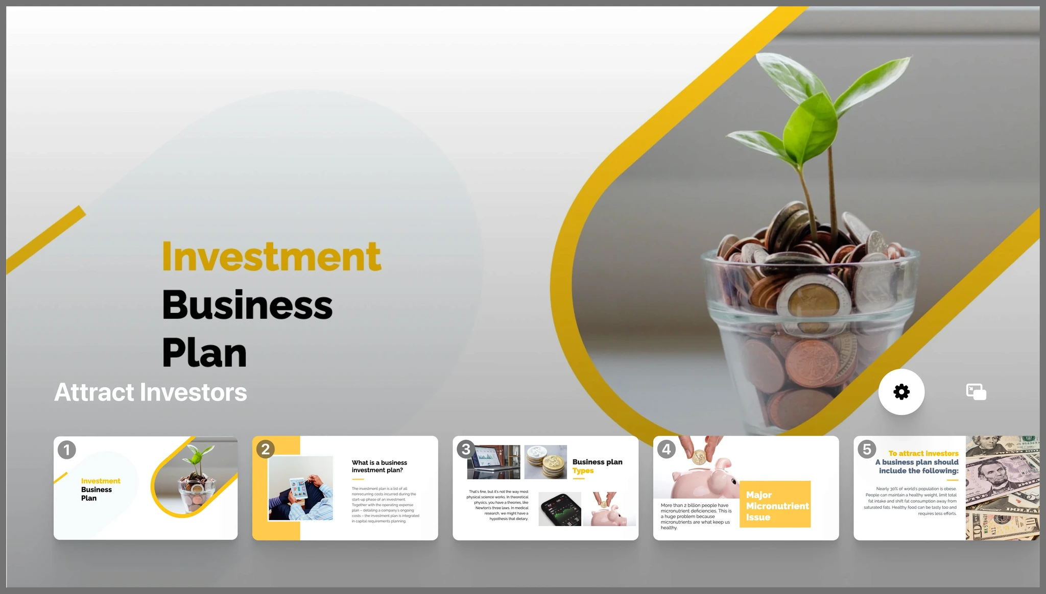

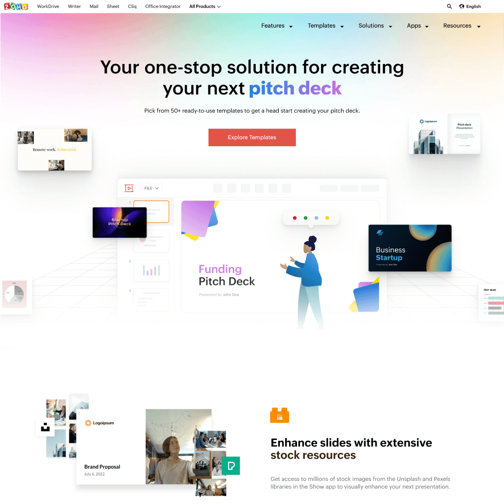
Designed several web pages to highlight the diverse features and solutions of Zoho Show.
Utilized responsive design principles to ensure accessibility across various devices.
Replacing ad-hoc elements with design system components helped improve the product's performance by 55%.
Conducted education and testing sessions for the designers to use the design system.